A Legacy Refined, A Brand Realigned
Doug Kelley came to us with a clear vision and longstanding trust—ready to refresh how Kelley Wolter showed up in print and online.
Industry
Law Firms
Client
Kelley Wolter
Services Provided
— Brand Discovery
— Moodboarding & Direction Setting
— Print Collateral
— Visual Identity Exploration
— Wordmark Refinement
A Thoughtful Start to a Long-Term Shift
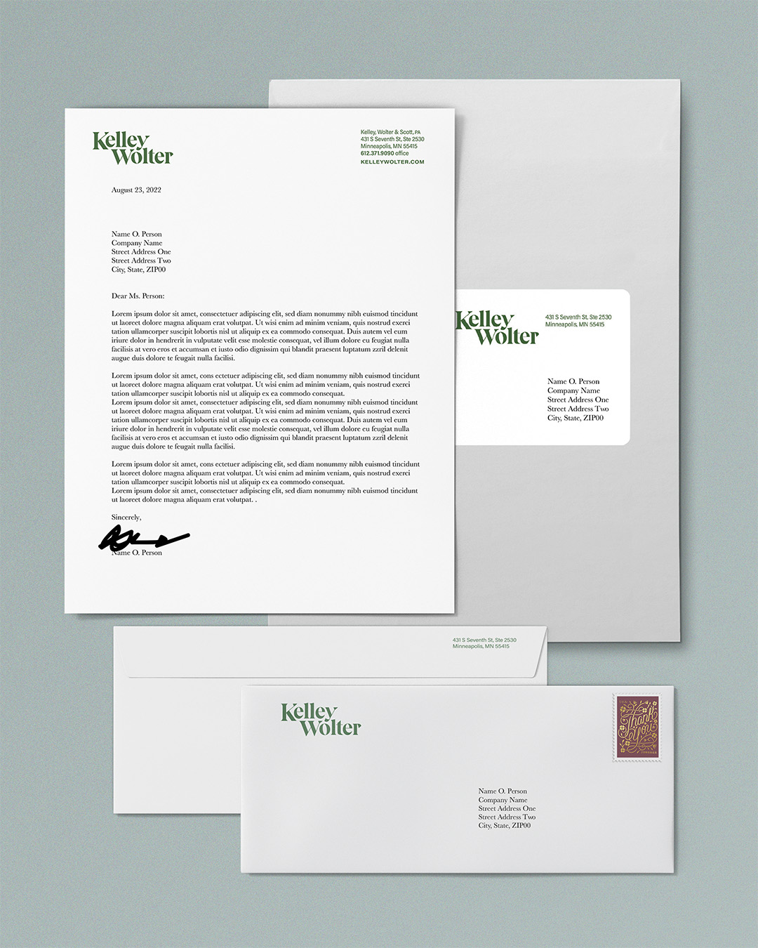
Our work began with a single announcement, celebrating Brett Kelley’s new partnership role. It was an opportunity to test format, tone, and design direction. Inspired by Greene Espel’s polished materials, Doug sought a similar level of craft and restraint.
We presented multiple print formats—flat and folded—exploring subtle shifts in color, typography, and use (or absence) of brand marks. This moment also opened the door to larger brand questions: Could this aesthetic serve as a soft reset? What would a more holistic identity look like?
Brand Discovery That Moved Beyond the Page
As we expanded the engagement, we reviewed current assets, competitor presence, and visual inconsistencies across platforms. Photography styles, tone, and overall identity varied significantly.
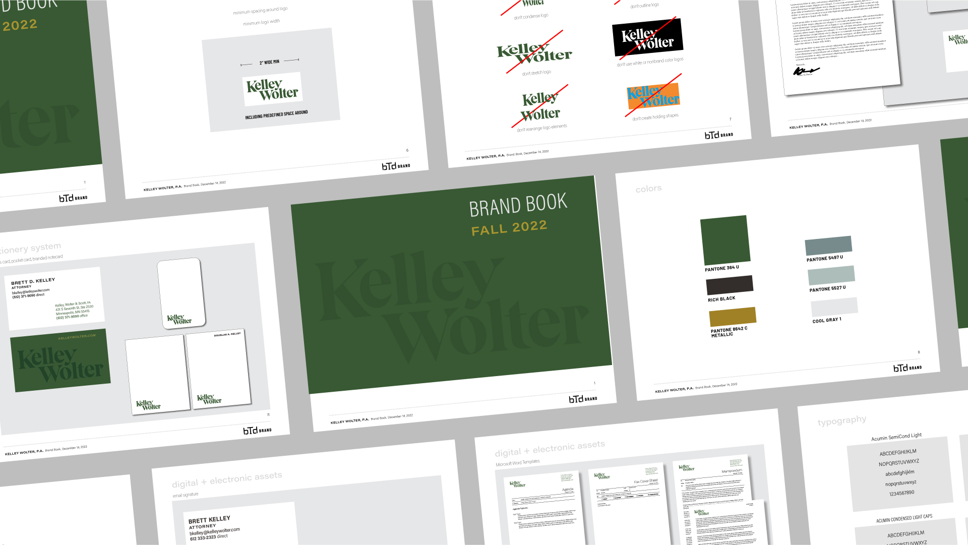
To bring clarity, we proposed a new suite of assets—photography, social presence, and web mockups—alongside moodboards that explored appetite for both bold and minimal approaches.
The outcome was a set of visual directions anchored in Kelley Wolter’s professional excellence and understated confidence.
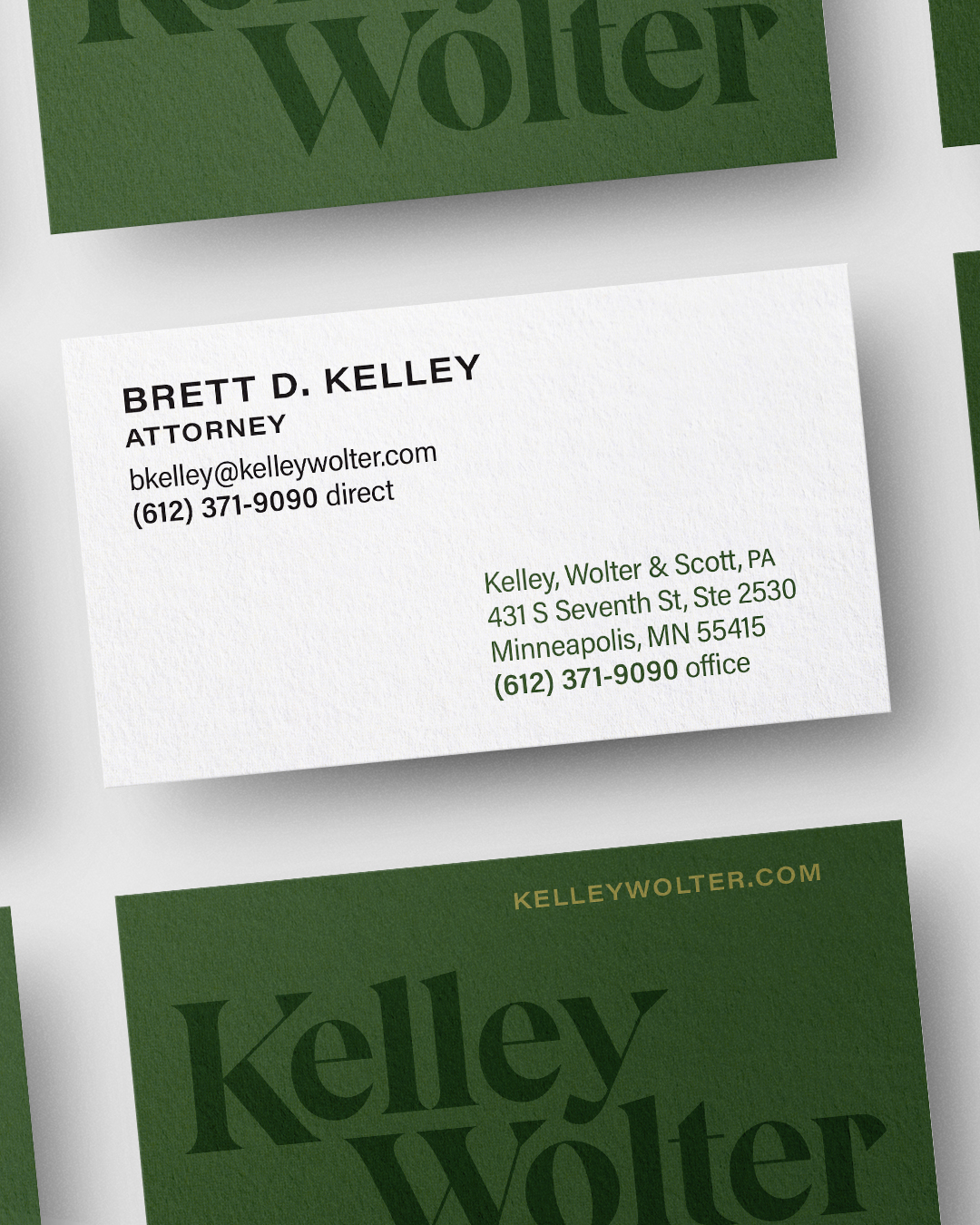
A Name, Refined. A Brand, Realigned.
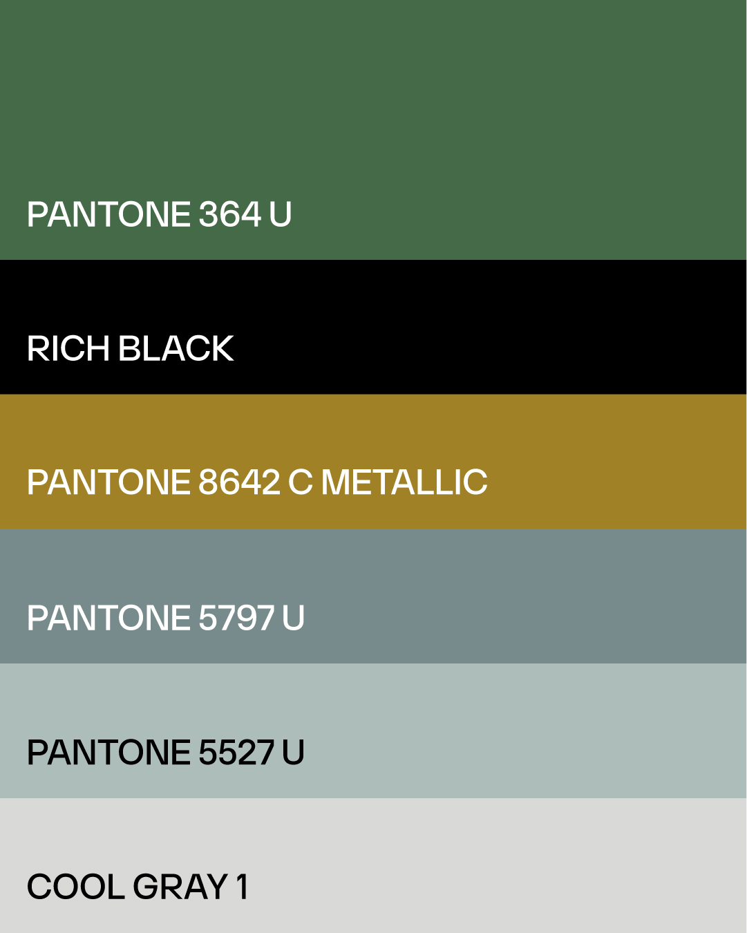
The firm had once carried a longer name—Kelley, Wolter & Scott—but with a simplified domain (kelleywolter.com), the timing was right to reinforce a focused identity.
We refined the wordmark through typographic studies and real-world context testing, prioritizing not just what looked strong, but what felt right.
Rather than rush into elaborate systems, we piloted concepts across printed pieces and digital screens—building a brand rooted in clarity, continuity, and credibility.
More Work
See All Our Work