From Tradition to Transformation: A Brand Journey 30 Years in the Making
What began with printed pieces grew into a decade-long collaboration—culminating in a bold rebrand that honors Greene Espel’s legacy while energizing its future.
Industry
Law Firms
Client
Greene Espel
Services Provided
— Art Direction
— Brand Strategy
— Design System
— Event & Environmental Design
— Logo Refresh
— Marketing Collateral
— Visual Identity
— Website Design
They're so thoughtful, but also really approachable.
Their ability to translate a feeling and a culture into a design, into visual materials, has been really exceptional. They're really collaborative and there’s a lot of really good back and forth where we kind of wrestle with an idea and they offer feedback. They're able to help shape my thoughts and vice versa. They're so thoughtful, but also really approachable. It’s a really nice back and forth, and we always sharpen one another.
Chelsea Berglund
Marketing & Business Development Manager
From Announcements to Identity: Evolving with Intention
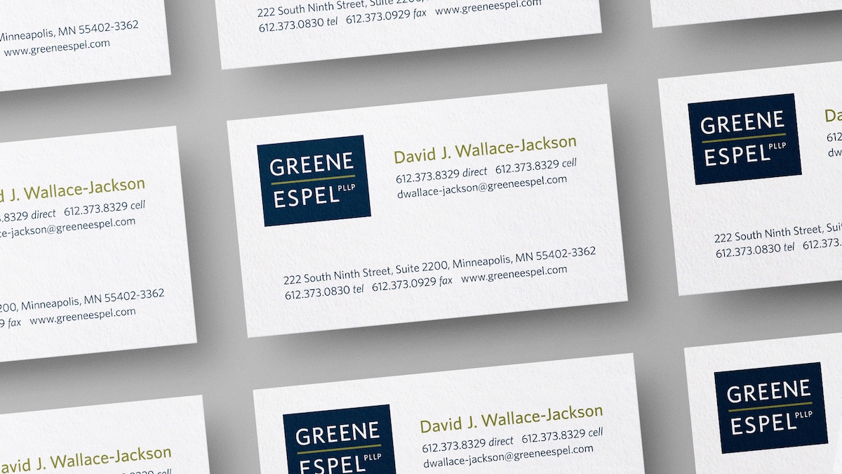
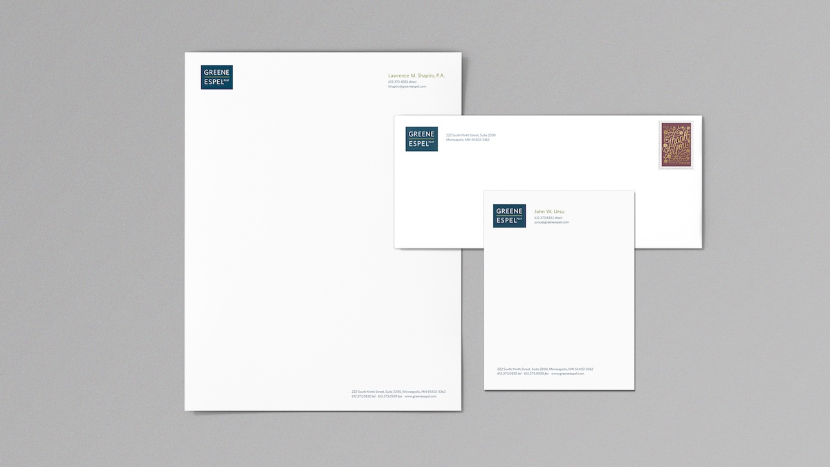
Our collaboration with Greene Espel began in 2011 with print materials—holiday cards, attorney announcements, and event signage—all built around their original 1993 logo.
In 2013, as the firm approached its 20th anniversary, we led a logo refresh process. Working closely with an internal attorney committee and marketing lead, we modernized the identity for digital clarity and generational appeal—preserving its essence while giving it new life.
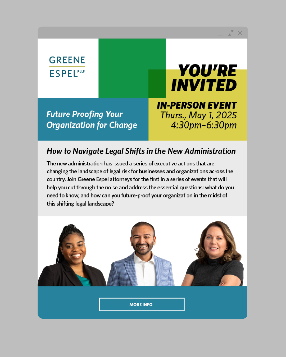
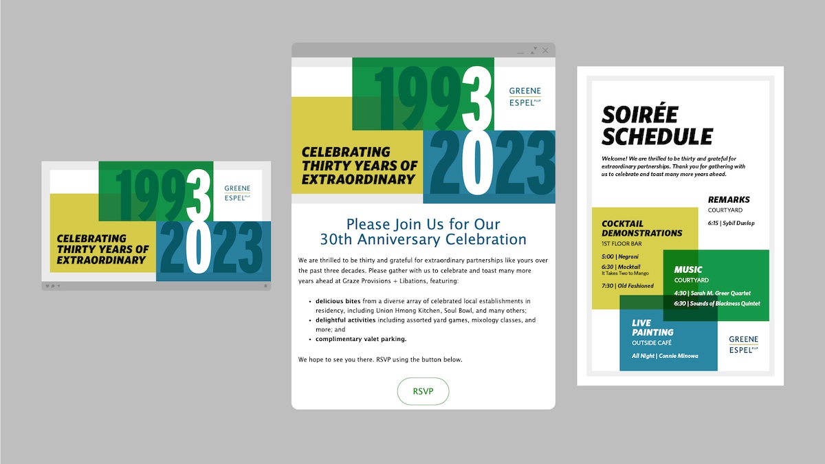
By 2021, with the 30-year milestone on the horizon, the firm sought a deeper transformation. Their vision: to reflect a public commitment to diversity, individuality, and growth. Together, we developed a new brand and website—launched in 2023—centered around the positioning “Gather Extraordinary.”
The refreshed system included saturated color palettes, overlapping forms, and a photography style that celebrated individuality over uniformity. The identity flexes across digital, print, and environmental applications, offering both strength and adaptability.
This wasn’t just a rebrand—it was a clear signal of purpose, designed to carry Greene Espel into their next chapter.


More Work
See All Our Work